PANTONE®, the Gods of all things color, calls the Fall 2015 color palette "an umbrella of accord that weaves earthy neutrals with a range of bold color statements." The palette is supposed to make us feel warm and security.
Marsala – the color of the year – is a winey red-brown, and supposed to evoke a delicious and filling Sicilian meal. Unlike its predecessors (that stayed in the interior design), Marsala has dominated the fall runways, despite being a rather difficult color to wear. Go for a deeper version (more barollo) and mix it with black.
Dried Herb – yet another olive green shade. Together with Desert Sage, they are marketed as the new neutrals and sophisticated and chic. With massive troops still on the ground in Middle East – these military colors, in one shade or another, will be repeated year after year. (Nicole Miller took it literary and walked desert camo down the runway.) So yes, recycle that olive green jacket from last year. Update it with structured pieces in black. Channel boots come to mind. (Cue the Devil Wears Prada)
Stormy Weather – a cool blue gray reminiscent of a gloomy overcast day – is the neutral of the year. It works well with every color and look fabulous in metals. In fact, it is such an easy color to work with that it will dominate RTW* retail. This is the color that's worth the splurge. Get a classic silhouette to make it a wardrobe staple. And, go ahead, paint your walls with it – it'll still be on trend five years from now. Unless you're in Chicago, then you'll have gloom indoors and out.
Oak Bluff – the sun after Stormy Weather – is a deep warm golden yellow. Splurge on a bag or a coat. Do not think that the ugly mustard sweater you got on sale previous years can pass as Oak Bluff. Expect RTW to play safe and substitute lighter camel for Oak Bluff.
Stormy Weather+Oak Bluff=classy chic. Oak Bluff+Marsala=messy lasagna. Choose wisely.
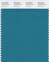
Biscay Bay – a bright teal – reminds me of cool ocean waters. Wear it when you miss summer. Which, if you're like me, is nine months out of the year. Unless you live on the coast.
Reflecting Pond – is a blue black with teal undertones. This deep shade is the new navy: conservative, credible, and stable. Prefect for all those boardroom aspirations. Will be able to last so worth the investment.
Cadmium Orange – a blushy pinkish orange – is the nod to 60s and 70s. Pairs well with Reflecting Pond and Stormy Weather. Will look best in silk. Not for everyone (pale girls be ware). Will be appearing as a flatlay background in blogosphere near you.
Cashmere Rose – another 60s update – is an upscale dusty pink. Most likely to appear as part of a pattern, and in makeup. Paint your nails with this, it has a short shelf life.
Amethyst Orchid is a cooler, bluer, and more subtle sister of Radiant Orchid. A lot easier to tolerate as a print. Yet another one season wonder. Brave enough for a Cashmere Rose/Amethyst Orchid total look? Go for the Italians – Armani and Valentino said "amore!" to both colors from head to toe.
 For the kiddos: PANTONE Minion Yellow. Yes, it does exist. And it's an industry first – the first color to be created and named after a character. It is the first new color in three years. I foresee yellow bedrooms with denim bedding sprouting across the globe. Now, if they could just develop Bond black, I'd be all over it...


